Carpet Tile Style
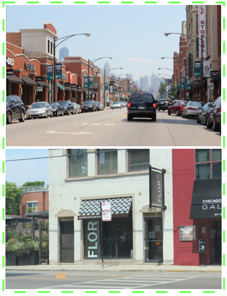
Last weekend, our search for a rug for our living room took us all the way to Chicago. The drive wasn't so bad, only an hour and forty minutes from our house to the cute neighborhood near downtown where we hit the Flor store. Then we walked around and had lunch at the amazingly delicious Franks 'N Dawgs. My youngest daughter ate the entire kid hot dog meal which looked like it was made for a very hungry child three times her size.
If you're wondering why there's a picture of David Hasselhoff attached to our table, that's because instead of picking a number, you pick a celebrity picture from the "Wall of Shame." I went for the first one I recognized. The guy taking my order must have thought I was a huge fan by the way I shouted out his name while grinning proudly. That was only because I didn't recognize (or, at least, couldn't name) ANY of the other celebs and I was just relieved that I wasn't totally clueless when it comes to tabloid celebs.


Did you make it all the way down here? For some reason I can't write in between pictures today.
So back to carpet tile shopping. These Flor tiles seem like such a good idea for a few reasons. #1 you can pop off individual tiles and wash them in the sink (just not the wool ones), which is great if you have little kids. #2 I've been having a hard time finding an affordable area rug that's big enough for our living room. #3 They have their own version of sisal which seems softer than a real sisal rug (what I was originally planning on buying) and it comes in grey. The grey sisal rugs I searched for online looked a little strange.
While searching through samples at the store, I fell in love with these orangey striped tiles called "mod macrame." It reminded me of a comfy old sweater and the color could be fun. But when I got home, I plopped down the sample on our wood floors and they just blended right in instead of popping the way I hoped they would. The pattern almost mimics the wood grain. I guess the wood floors from the catalog shot were much darker because they just looked so good in there. I tried them on top of the dark tansu and, sure enough, they looked much better (although thanks to my camera settings, it almost looks like the opposite is true). We came home with a total of 3 samples: the orange or "harisa" mod macrame, the sisalesque "suit yourself" in pumice and "quality time" in pewter. Quality Time is sort of a nubby, wool-look tile that ended up reminding me of a hotel. So it looks like we're going with Suit Yourself in pumice. I'm waiting one full week before making a decision though... just to be safe.
Professional images via Flor. Others by me (and my husband).


Comments